2025 - Product Design / Mobile & Desktop

Vypo / Arcor
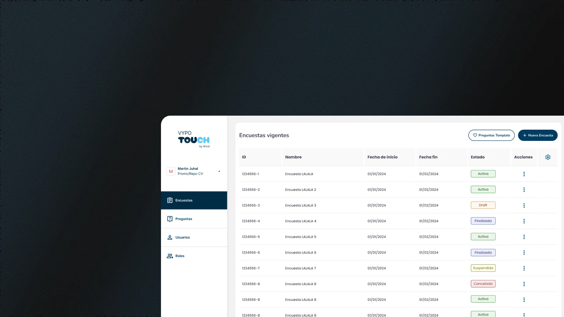
Mobile app and desktop dashboard for Arcor merchandising operations. Surveys with automatic queued submission, routes, tasks and photo upload at points of sale.
— Role sheet
- Role
- UX/UI Designer
- Team
- Rodrigo del Rio (PO), Carlos Acosta (UX Lead), Soledad Yafar (PM), Juan Martín Cerruti (Lead Dev)
- Duration
- 10 months (MVP)
- Platform
- Web & App
- What I did
- Research, UX and UI for mobile and desktop + Design System
— Context
Merchandisers without a system in a disconnected
Arcor's merchandisers had no tool to organize their daily tasks or record their work at points of sale. Management was done through shared Excel files, causing typing errors, lost metrics and a lack of visibility into the status of stores.
I interviewed Arcor's Customer Service Leader and merchandisers and identified three critical pillars: a dashboard for leaders, a support/help desk system, and an Android app for field merchandisers. The user persona Esteban Acerbi represented the typical merchandiser: he needed to report incidents in offline areas, with simple flows and clear feedback. The challenge was to reduce daily reporting friction and ensure nothing is lost due to lack of signal.
— Solution
A mobile + desktop ecosystem with guaranteed delivery
A mobile app was designed so merchandisers can view their assigned tasks, complete surveys, upload photos and follow routes. If there's no connection when submitting, the app saves the survey in a queue and sends it automatically when the signal is restored, whether via WiFi or data. In parallel, a desktop dashboard allows leaders to create surveys, assign jobs, manage users and roles, and administer multiple workspaces.
I started with qualitative research: interviews with leaders and merchandisers, surveys via SurveyMonkey, and analysis with Google Analytics and Google Sheets. I defined the user persona Esteban Acerbi and mapped the critical flows. Then I designed the complete ecosystem in Figma: desktop dashboard for management and Android app for the field. I prioritized the offline send queue, cutting reporting steps from 5 to 3, and visual clarity for users with low tech familiarity. I planned each stage with Carlos Acosta, UX Lead, who supervised the work: I presented and defended each proposal to him and, once aligned, to the PO and stakeholders.
— Features
Two products, one objective
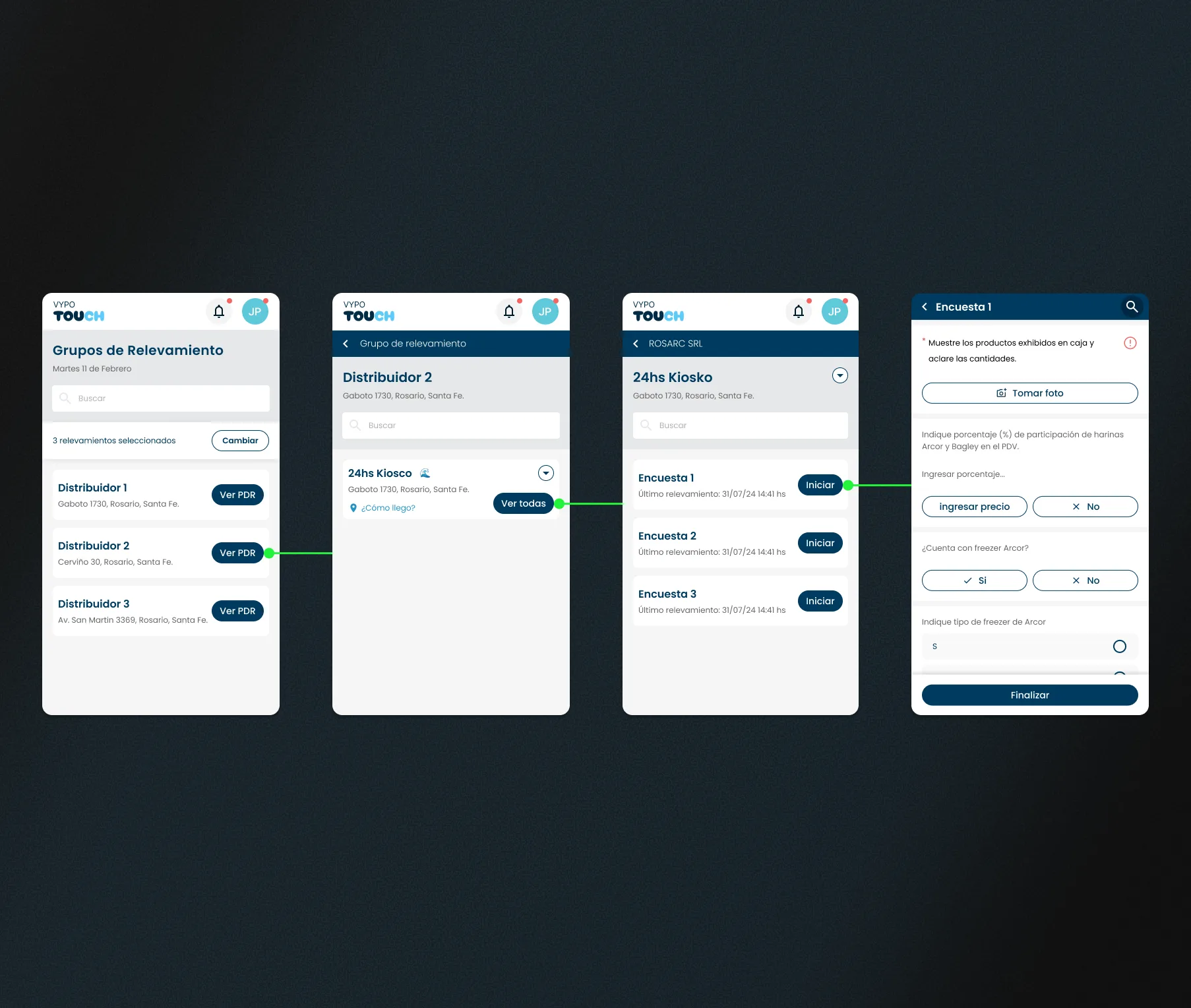
Mobile appSurveys with queued submission
Merchandisers access their daily tasks, complete surveys with different response types, upload photos and follow optimized routes. If there's no connection when submitting, the survey is queued and transmitted automatically when the signal is restored via WiFi or data. The merchandiser doesn't have to worry, and Arcor receives the results.
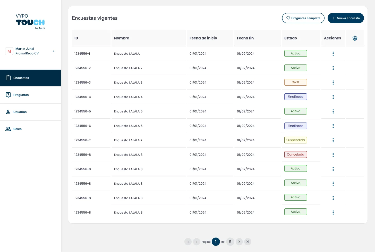
DashboardSurvey and user management
Leaders create surveys with a question builder, assign tasks to merchandisers specifically or in bulk, and manage users with differentiated roles (leader, merchandiser, client).
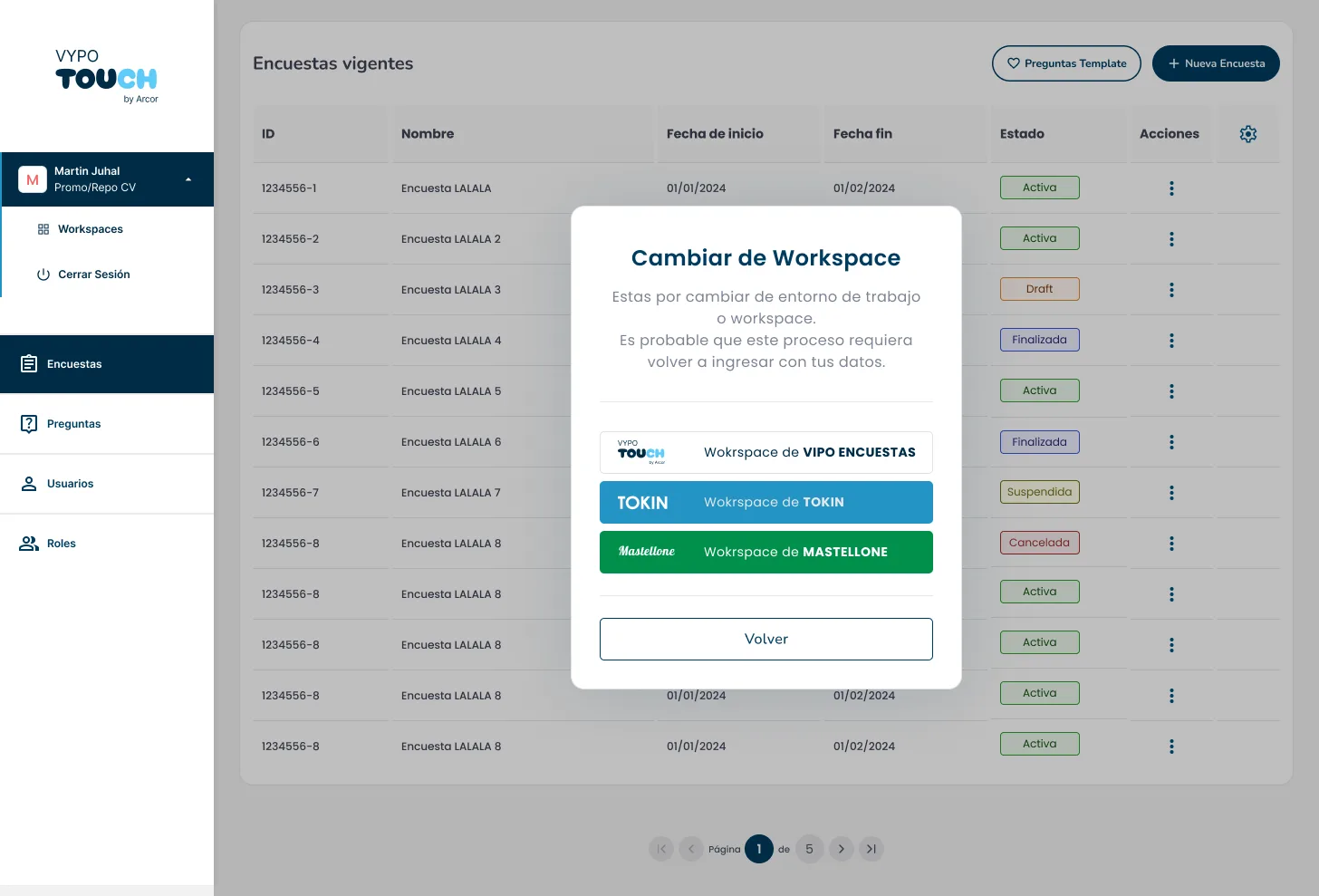
Multi-company workspaces
Support for multiple workspaces that isolate data and configurations by company or region. Ideal for scalable operations within Arcor.
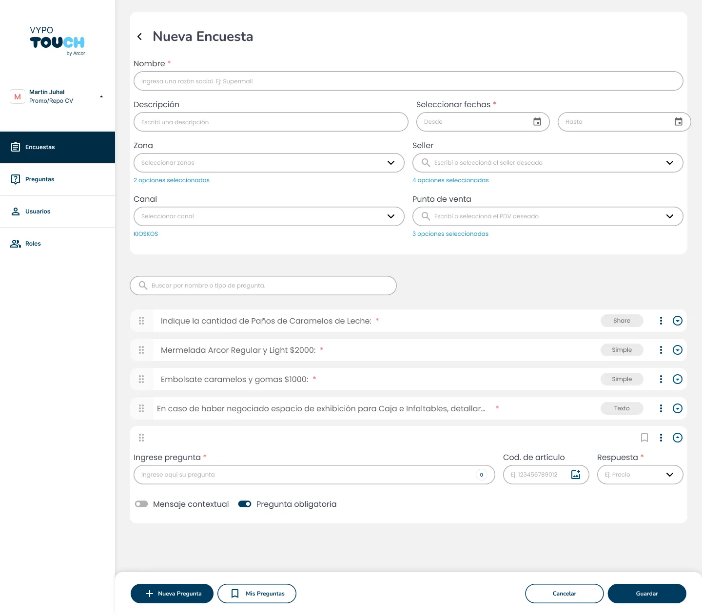
Survey builder with images
Flexible survey creation system that allows adding questions with different response types and integrating images as visual reference for merchandisers in the field.
Role-based interface
Depending on the user's role in the dashboard, different options are shown. This reduces human error and the confusion of seeing data that isn't relevant to that role.
— Tech stack
Design and prototyping tools
My research included interviews with Arcor leaders and merchandisers, surveys via SurveyMonkey, and data analysis with Google Analytics and Google Sheets. I defined user personas such as Esteban Acerbi and identified three product pillars: dashboard for leaders, support/help desk system, and Android app for merchandisers. I used Figma to design the complete high-fidelity ecosystem, with interactive prototypes tested with real users. Then the MVP was developed and I participated in gathering feedback for later iterations.
— Key decisions
Decisions that shaped the project.
Offline send queue — areas without signal
The problem
Merchandisers work at points of sale where connectivity fails: research showed they needed to report incidents in offline areas and that nothing could be lost because of it. A form that depends on connectivity was simply not viable for real-world use.
The options
- —Block submission without connection and show an error: simple to design, but the data is lost or depends on the merchandiser's memory.
- —Save a draft and ask the merchandiser to retry manually: less system logic, more mental load and risk of forgetting.
- —Automatic send queue that retries when signal returns: more states and sync logic to design and communicate.
The decision
I chose the automatic send queue: if there's no connection when submitting, the survey stays queued and transmits itself once signal returns, via WiFi or data. The merchandiser doesn't have to worry at all. The trade-off was designing and surfacing the sync states so the user always knows what was sent and what's pending, instead of hiding that complexity.
3-step reporting — users with low tech familiarity
The problem
The typical merchandiser (user persona Esteban Acerbi) reports every day, on the move, with low tech familiarity. The existing reporting flow had 5 steps, and every extra step was daily friction multiplied by every point of sale.
The options
- —A single long form with everything visible: less navigation, but overwhelming and harder to track progress.
- —A wizard of many short steps with fine-grained validation: more control, but more taps and more time per report.
- —Compress the flow to 3 essential steps: less granular control per screen, but a fast, predictable report.
The decision
I cut reporting from 5 to 3 steps, prioritizing speed and visual clarity for someone using the app in a store aisle. What's sacrificed is very granular validation and room for lengthy explanations on each step; in return, the merchandiser finishes the report fast, with fewer drop-offs.
One Design System for mobile and desktop — W3C tokens
The problem
The ecosystem had two products with opposite usage contexts: an Android field app for merchandisers and a desktop dashboard for leaders. Keeping two visual languages could make the experience diverge and slow down the handoff to development.
The options
- —Two separate visual systems per platform: faster start, but divergence and double maintenance.
- —A single system with shared, exportable tokens: more upfront architecture, but guaranteed consistency across devices.
- —Loose per-screen styles with no system: maximum initial speed, chaos when scaling.
The decision
I chose a single Design System defined as Figma variables and exported to a JSON file compatible with the W3C Design Tokens standard, organized into four collections (Brand, Alias, Mapped, Typography). The same tokens feed mobile and desktop, so a change to a base value propagates to both products. The cost was the upfront architecture time and decisions that must work in two very different usage contexts. That same system, which I maintained together with Carlos Acosta (UX Lead), was later reused to design similar dashboards for other clients, such as Mastellone.
— Next steps
Learn more about Vypo / Arcor
Mobile app and desktop dashboard designed to transform merchandising operations in the field. Automatic queued submission, real metrics and operational scalability.