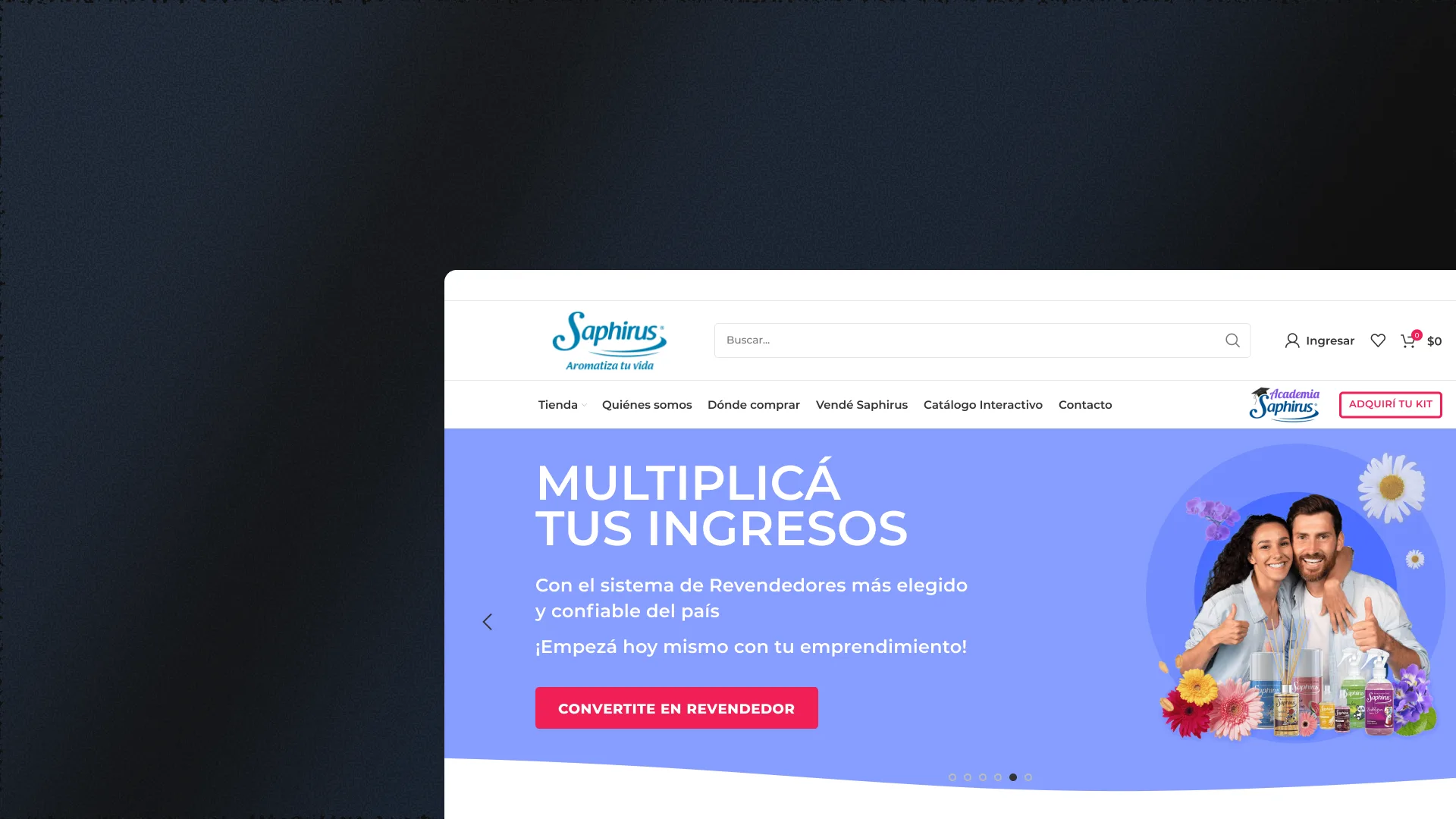
2024 - UX/UI Design / Ecommerce

Saphirus
Improvements and iterations on the official Saphirus ecommerce. Renovated home, optimized cart and checkout, and new sections designed to convert.
— Role sheet
- Role
- UX/UI Designer
- Team
- Nadina Mazziteli (CCOI & PM), Daiana de la Vega (UX/UI), Matías Scovotti (PO), Álvaro Albornoz (Lead Dev)
- Duration
- 6 months
- Platform
- Web
- What I did
- Store redesign + Saphirus Academy
— Context
An online store that needed to evolve
The official Saphirus ecommerce had a home page that did not feature flagship products, a purchase flow with visible friction in cart and checkout, and no section to locate physical points of sale. These shortcomings reduced the conversion rate and made it difficult for users to complete a purchase from start to finish.
Saphirus adopted a continuous evolution strategy: instead of a full redesign, strategic iterations were prioritized on the sections with the highest conversion impact. Each improvement was designed, tested with real users and measured before moving on to the next, generating a sustained optimization cycle aimed at selling more and better.
— Solution
Strategic iterations to increase conversions
The entire home page was redesigned with featured sections, best-selling products and visible promotions. A "Where to buy" page was created to make it easier to find physical points of sale. The cart and checkout were optimized by reducing steps and improving visual clarity.
The product page was redesigned to enhance the presentation of technical specifications and images, and the user profile was adjusted for a more personalized experience. Each change was iterated with the development team and its impact on business metrics was tracked before the next release.
— Features
Renovated sections to sell more
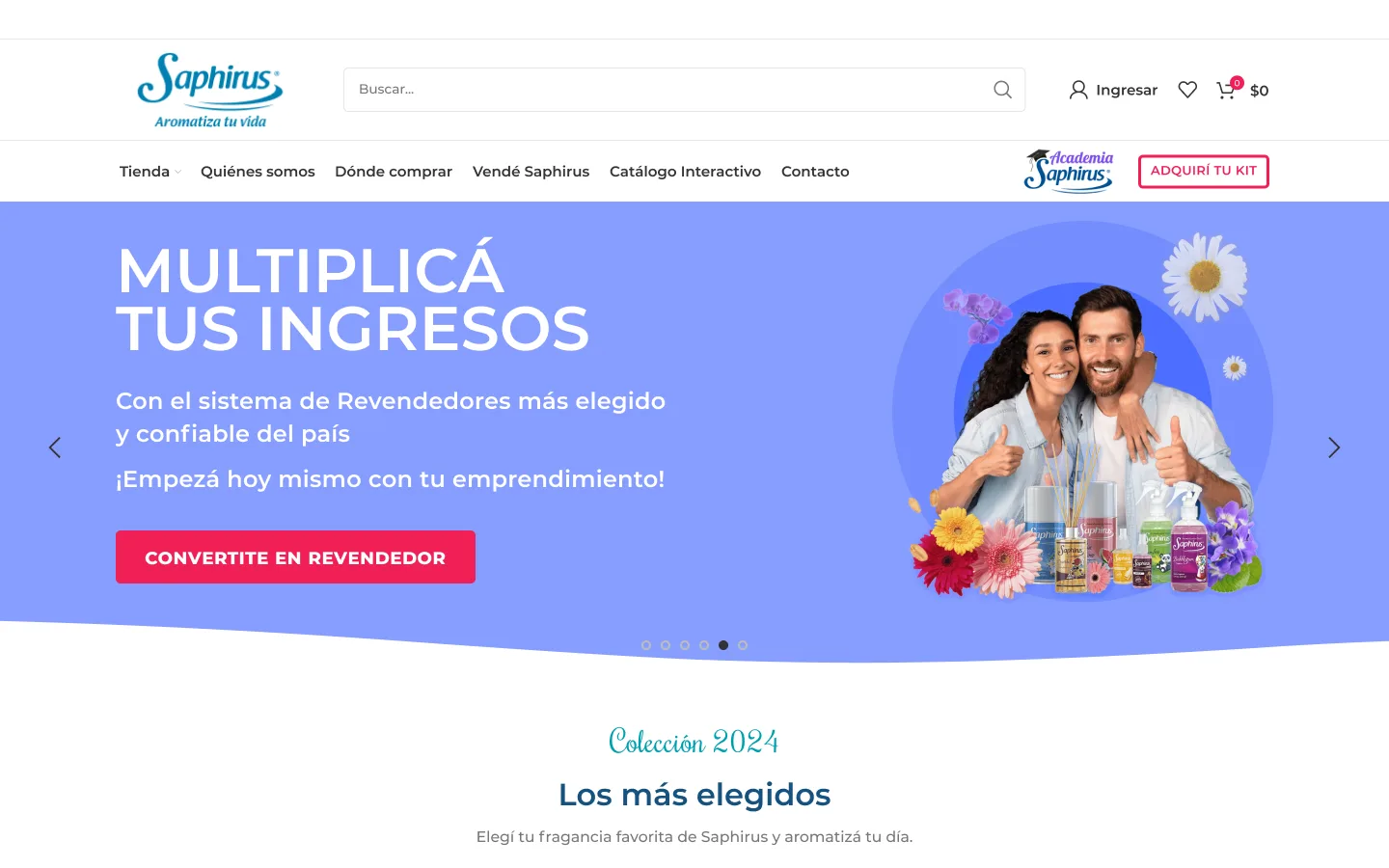
HomeRenovated landing experience
Complete home redesign with featured monthly sections, best-selling products, invitation to Saphirus Academy and visible promotions like Father's Day. Visual hierarchy that guides the user towards purchase.
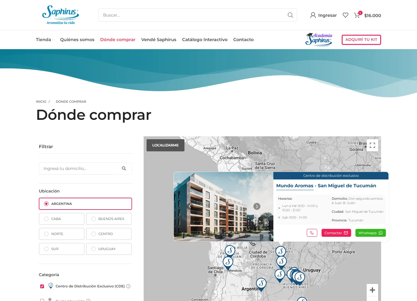
Where to buyStore locator
Page designed so users can easily find where to buy Saphirus products near their location. Intuitive geolocation and filters by province/city.
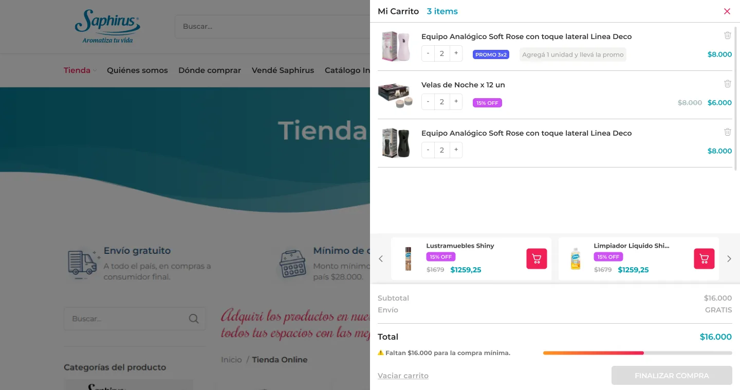
Cart and checkoutOptimized purchase flow
Cart redesign with clear summary of products, quantities and totals. Simplified checkout with fewer steps, progress indicators and visible payment options. Less friction at the critical conversion point.
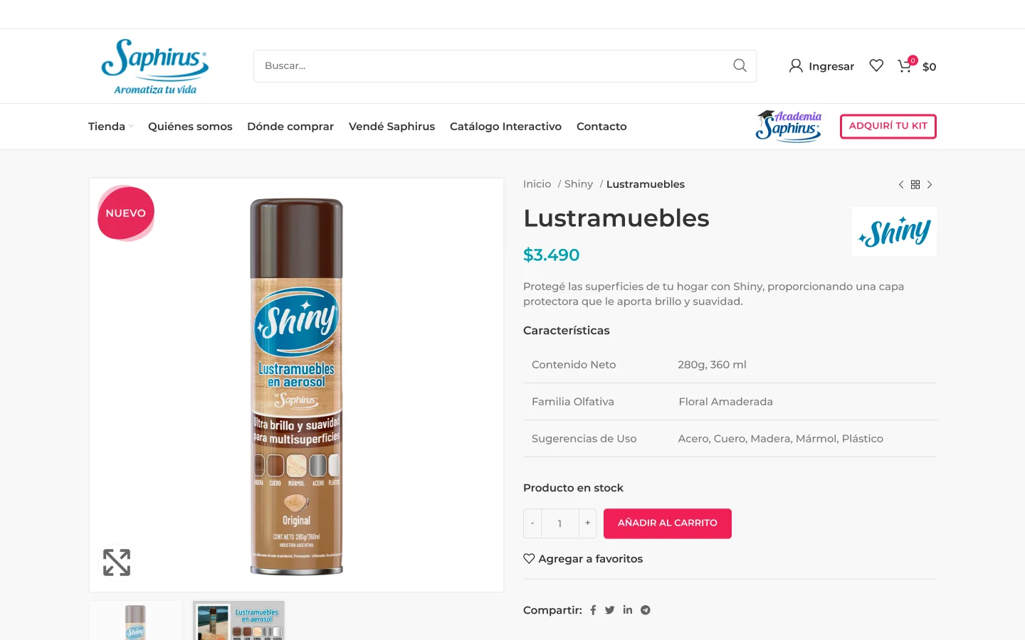
Product pageTechnical specs and conversion
Improved product page with quality images, clear description, prominent price and always-visible purchase CTA. Designed to convert visitors into buyers.
— Tech stack
Design and prototyping tools
All design and prototyping was done in Figma. For banners and visual assets I used Photoshop and Illustrator (Adobe Creative Suite). My role included redesigning each section, iterating with the development team and tracking post-implementation metrics to validate the impact of each change.
— Results
Iterations measured at each release
06
months of continuous iteration with the Saphirus team
05
redesigned sections: home, "Where to buy", cart, checkout and product page
— Key decisions
Decisions that shaped the project.
Iterate section by section — instead of a full redesign
The problem
The ecommerce had several weak fronts at once: a home page that didn't feature flagship products, friction in cart and checkout, and no section to locate physical stores. The temptation was to tear it all down and start from scratch.
The options
- —Full site redesign in a single project: strong visual impact, but months without improvements in production and all the risk concentrated in one launch.
- —Strategic iterations on the sections with the highest conversion impact: gradual progress, each one tested and measured before moving to the next.
The decision
I chose continuous evolution: prioritizing the sections with the highest conversion impact and tackling them one by one. Each improvement was designed, tested with real users and measured before the next release, which lowered the risk of every change and gave us concrete evidence of what worked. What you give up with this approach is the 'big relaunch' effect: the site improves in stages and there's no single moment where everything changes.
Fewer steps and guest checkout — the critical conversion point
The problem
Cart and checkout were where the purchase flow had its most visible friction: users arrived with purchase intent and dropped off in the final stretch.
The options
- —Single-screen checkout with all fields at once: fast in theory, but a wall of form fields that intimidates.
- —Multi-step flow with mandatory registration: captures user data, but adds a barrier right before payment.
- —A flow reduced to fewer steps, with progress indicators and the option to buy as a guest or with an account.
The decision
I chose to simplify: fewer steps, visible progress indicators so users know where they stand, a clear summary of products and totals in the cart, and the option to buy as a guest. I also made sure users can go back without losing entered data. The trade-off of not forcing registration is capturing less user data for marketing, but I prioritized immediate conversion over database growth.
A "Where to buy" page — answering the most frequent question
The problem
The site had no section to locate physical points of sale, and it was the users' most frequent question. The question was how much design infrastructure to dedicate to that need.
The options
- —Answer it with text: a list of addresses or an FAQ entry — cheap to implement, but awkward to browse and with zero proximity-search value.
- —A dedicated page with geolocation, a map with pins and filters by province/city — more design and development, but it resolves the question in seconds.
The decision
I chose the dedicated page: intuitive geolocation, a map with pins and filters by province and city, with a detail card per store. The rationale was that this wasn't a marginal question but the most frequent one, and a plain text list answers it poorly. The cost was designing and building an entirely new section within an iteration-based project, but the result connects the online channel with physical sales — something no checkout improvement could achieve.
— Next steps
Learn more about Saphirus Ecommerce
Strategic iterations on the official Saphirus ecommerce. Each section was redesigned and iterated with the development team before implementation.