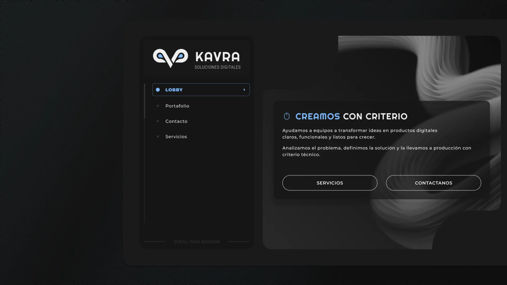
2026 - UI Design / Web Design

KAVRA
Corporate website for a software development agency. Minimalist design, side navigation and experience focused on conversion.
— Role sheet
- Role
- UX/UI Designer
- Team
- Juan Rossi and I
- Duration
- 5 days
- Platform
- Web
- What I did
- Design and usability
— Context
No digital presence in a saturated sector
KAVRA Digital Solutions operated without its own website. All communication happened through social media and freelance platforms, generating a fragmented digital identity and making it difficult to convert qualified leads.
Through a discovery session with KAVRA's CEO, it was identified that the priority was not just having a digital presence, but conveying technical confidence without falling into sector clichés. The initial requirement came as a visibility need, but the conversations revealed that what KAVRA really needed was an identity that scales with the company as it grows, allowing services and sections to be added without losing visual coherence.
— Solution
A web experience that's simple and direct
A minimalist and modern design was chosen with a focus on accessibility and navigability. The structure was organized into four main sections —Lobby, Services, Portfolio and Contact— with a persistent side navigation that allows moving between them without friction.
The design was structured with that scalability in mind: a modular side navigation allows new sections to be added without redesigning the entire site. The contact form was prioritized as the main CTA because the discovery with the CEO confirmed that the most valuable lead channel for KAVRA is direct contact. Since SEO was not a priority at this stage, the decision was made to prioritize interaction speed and a visual proposal that is unusual within the enterprise web development industry, but aligned with KAVRA's branding.
— Features
Sections designed to convert
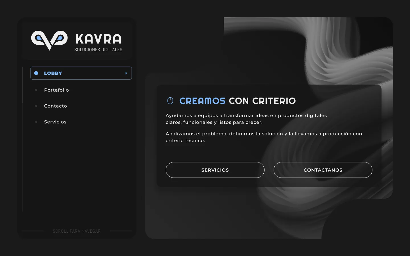
LobbyClear value proposition
Hero with the motto "CREAMOS CON CRITERIO" (We create with judgment), explaining the agency's focus on transforming ideas into clear, functional digital products. Two direct CTAs: Services and Contact Us.
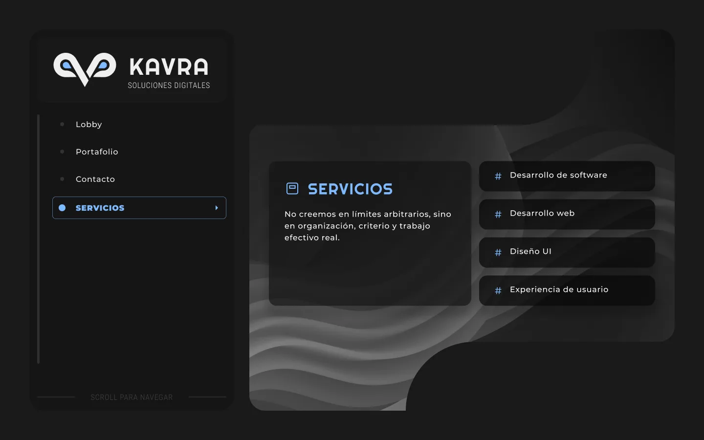
Services4 core capabilities
Clear listing of offered services: Software development, Web development, UI Design and User Experience. Each item presented with iconography and clean structure.
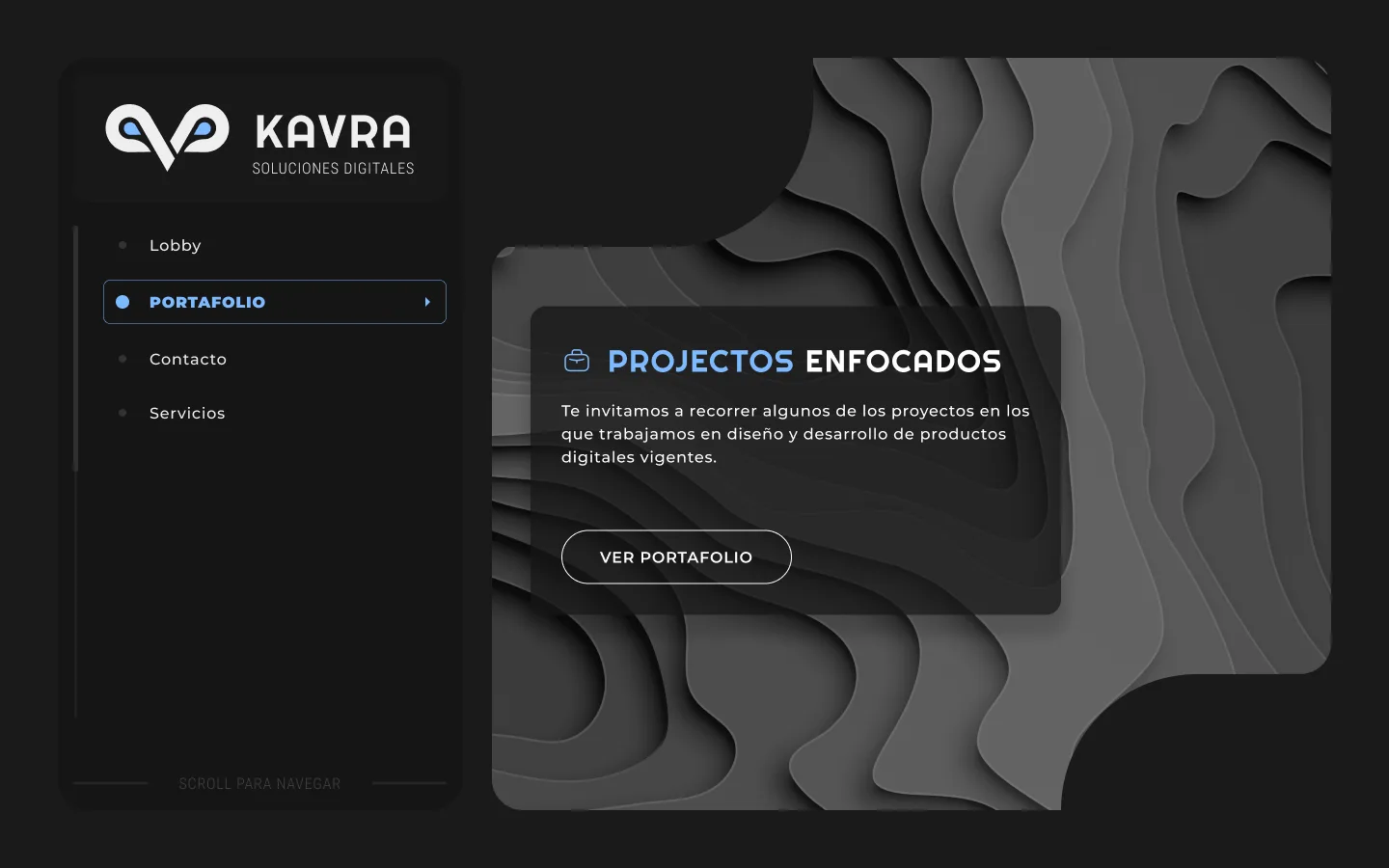
PortfolioFocused projects
Section inviting visitors to explore projects that KAVRA worked on in digital product design and development. "VIEW PORTFOLIO" CTA as the gateway to credibility.
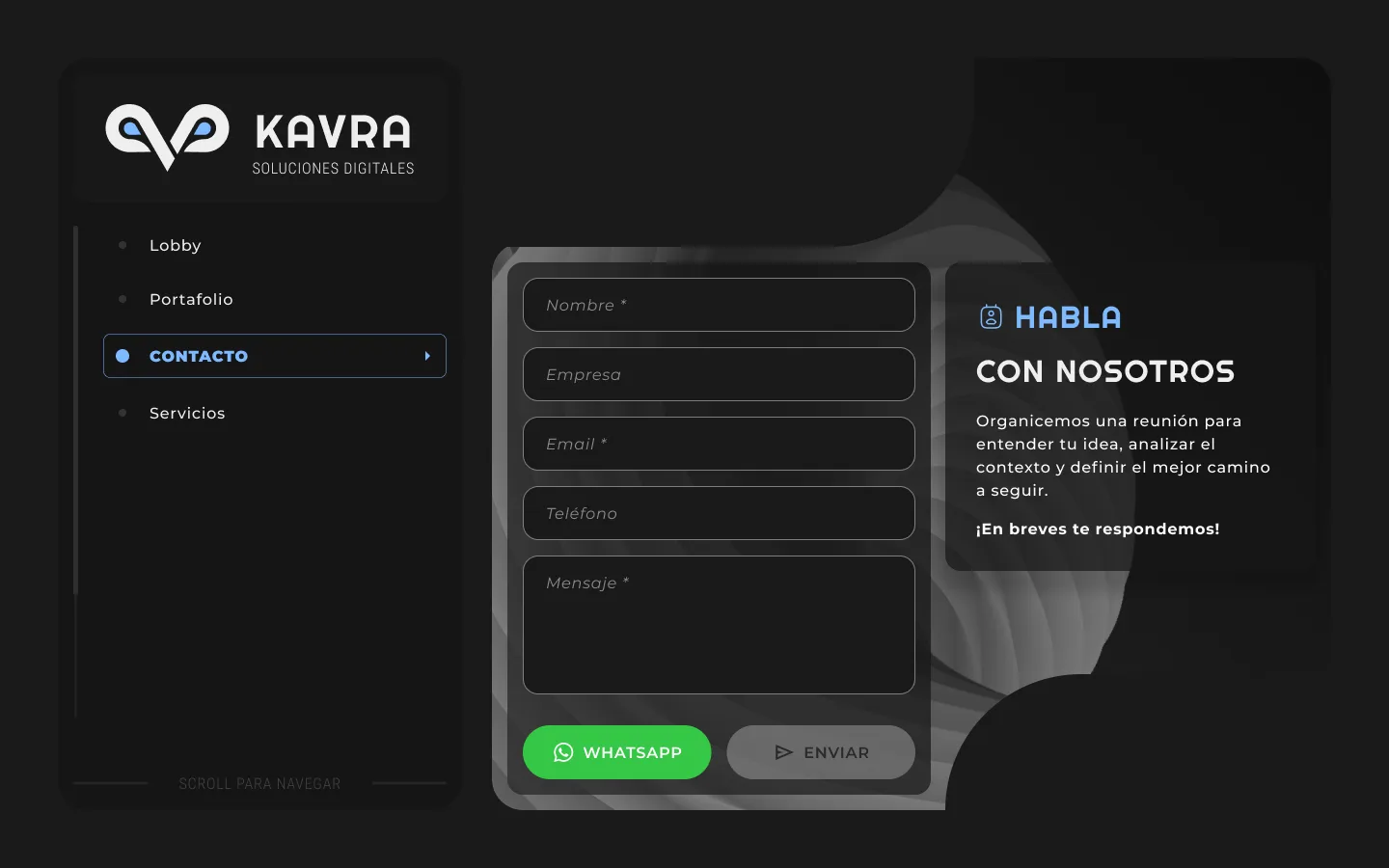
ContactForm + WhatsApp
Complete form with Name, Company, Email, Phone and Message fields. Direct WhatsApp integration and visual success state after sending. "Let's organize a meeting" as an opening message.
— Tech stack
Design and prototyping tools
My role in this project was prototyping and designing the entire experience. I used Figma for visual exploration and components, Figma Make to accelerate high-fidelity iterations, and Claude Code as a development assistant to bridge the gap between design and code. The application is still in development, but my design and prototyping delivery is complete.
— Key decisions
Decisions that shaped the project.
Side navigation — scalability over convention
The problem
The discovery with the CEO revealed that KAVRA didn't just need visibility: it needed a digital identity that scales with the company, allowing services and sections to be added without losing visual coherence. The navigation architecture had to support that growth.
The options
- —Horizontal top nav: the standard, most familiar pattern, but it becomes rigid and cluttered as new sections are added.
- —Hamburger menu: visually clean, but it hides navigation and adds an extra step to every section change.
- —Persistent side navigation: always visible and modular, though it's an unusual pattern for corporate sites and permanently takes up horizontal space.
The decision
I chose a persistent, modular side navigation: it lets users move between Lobby, Services, Portfolio and Contact without friction, and new sections can be added without redesigning the whole site. What I gained was real scalability and constant user orientation; what I gave up was the instant familiarity of the standard pattern, in exchange for a distinctive proposal within the sector.
Contact form as the main CTA — a single funnel
The problem
A corporate site can push visitors toward several goals at once: viewing the portfolio, exploring services, making contact. We had to decide which conversion actually mattered for KAVRA.
The options
- —Portfolio as the main CTA: show the work first to build credibility, but it delays conversion.
- —CTAs distributed with equal hierarchy: forces no path, but dilutes focus and makes it harder to measure what works.
- —Contact form as the main CTA: bets all conversion on one channel, with the risk of concentrating the funnel in a single point.
The decision
I prioritized the contact form as the main CTA because the discovery with the CEO confirmed that the most valuable lead channel for KAVRA is direct contact. I added a WhatsApp integration as an alternative path for those who'd rather not fill out a form. The trade-off was accepting a more concentrated funnel: if the form fails, there's no strong second conversion waiting behind it.
Interaction speed and a distinctive visual proposal — over SEO
The problem
The enterprise web development sector is visually saturated and repetitive. KAVRA needed to convey technical confidence without falling into industry clichés, and at this stage SEO was not a business priority.
The options
- —Conventional structure and aesthetics optimized for SEO: more predictable and search-engine friendly, but indistinguishable from the rest of the sector.
- —An unusual visual proposal focused on interaction speed: sets KAVRA apart, but gives up organic positioning at this stage.
- —A middle path: a safe design with a few distinctive touches, at the risk of neither standing out nor ranking.
The decision
I chose to prioritize interaction speed and a visual proposal that's unusual within the industry, but aligned with KAVRA's branding. It was a deliberate call: with SEO off the priority list at this stage, the value was in standing out and converting the visitors who were already arriving. What I gave up was organic positioning — a debt that will need to be paid when the business decides to invest in search-driven acquisition.
— Next steps
Learn more about KAVRA
Corporate website designed to build trust and facilitate contact. Functional minimalism with a focus on user experience.